Infographics are honestly one of the coolest ways to communicate big ideas. I didn’t always pay much attention to them, but the more I’ve gotten into topics like climate change, plant-based eating, and low-waste living, the more I appreciate how much a well-designed infographic can say without needing a ton of words.
For this post, I looked at three different infographics that I think do a great job of explaining important environmental issues in a visual way. Each one has a different style, but they all helped me understand something complex in a simple, visual format.
1. Climate Change in Numbers
Source: UN Climate Action – What is Climate Change?
This infographic is super impactful — it’s packed with huge, bold numbers that tell a really urgent story about our planet.
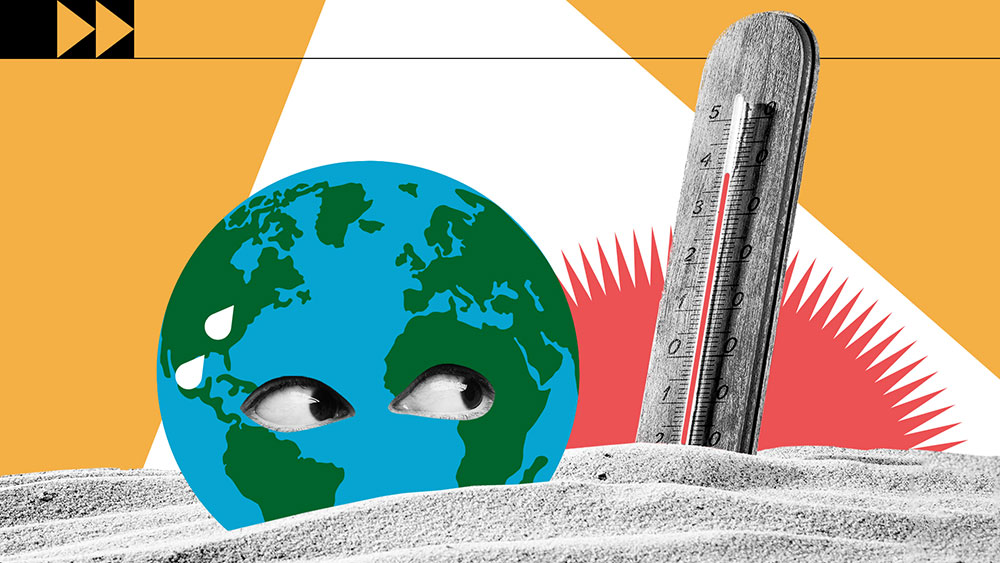
Why it works:
- Visual hierarchy: The big numbers and headlines instantly pull you in and guide your eye through the graphic.
- Color choices: It uses reds and oranges that make you feel the heat and urgency of climate change — literally.
- Typography: The fonts are simple, clean, and really easy to read.
- Text + visuals balance: There’s not too much text, which I like. Icons and graphics carry most of the message.
- Tells a story: It walks you through how climate change is affecting us now and what’s coming if we don’t act. It’s powerful.
2. What’s on Your Plate? Food & the Environment
Source: Our World in Data – Environmental Impacts of Food
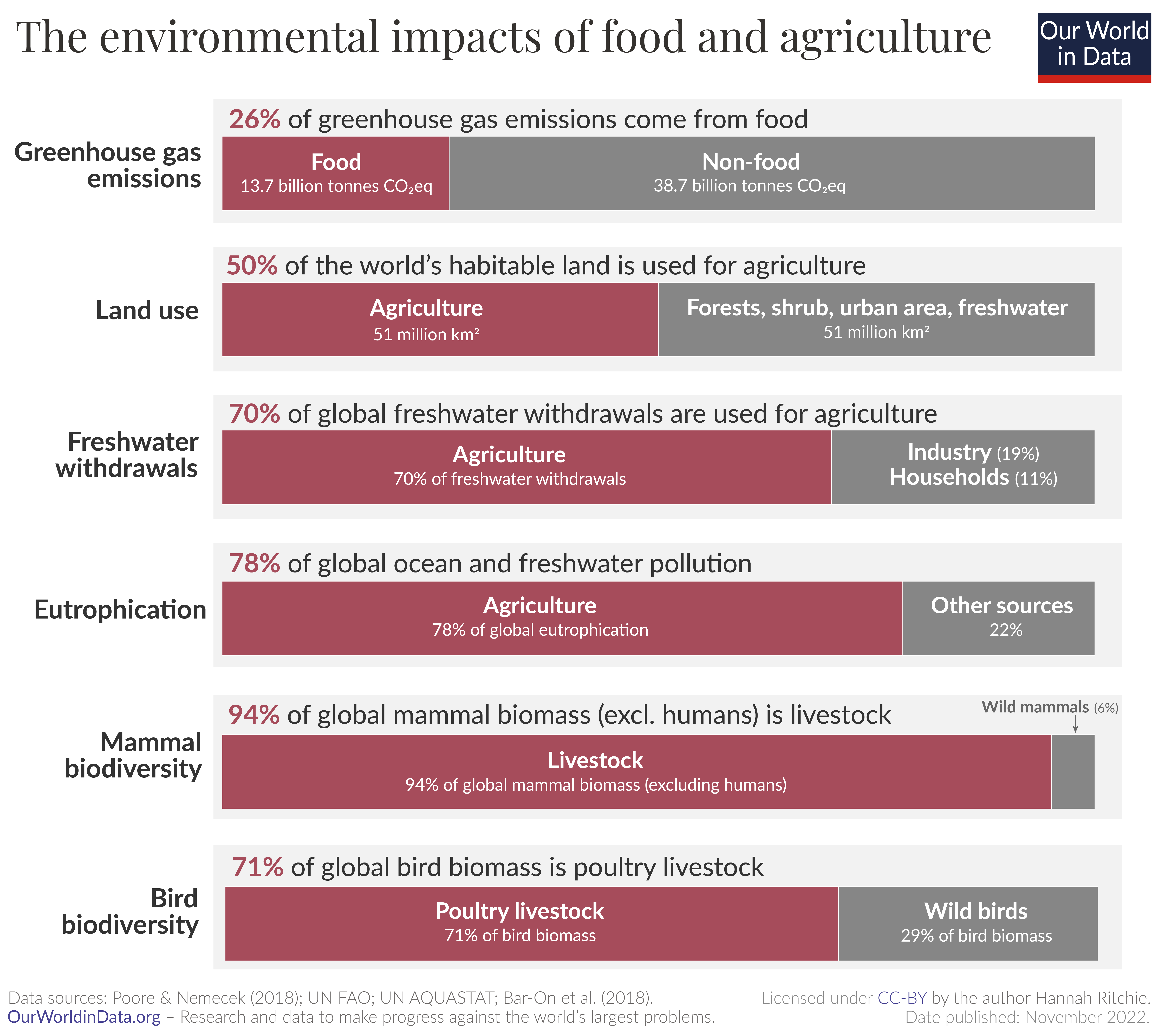
As someone who eats vegetarian, I loved this one. It shows the environmental impact of different types of food in a super clear and visual way.
Why it works:
- Visual hierarchy: The comparison charts make it super easy to see which foods have the biggest footprints.
- Color choices: It uses greens and natural tones that feel calm and eco-friendly.
- Typography: The text is straightforward and clean — no frills, but effective.
- Text + visuals balance: It’s mostly visuals, which makes it easier to scan and understand quickly.
- Tells a story: You can really see the difference between a plant-based diet and a meat-heavy one. It makes the data feel real.
3. 5 Ways to Go Zero Waste
Source: Earth911 – 5 Ways To Go Zero Waste
(Insert screenshot of the infographic here)
This infographic offers practical tips for reducing personal waste, inspired by Kathryn Kellogg, founder of Going Zero Waste, who famously fit two years’ worth of trash into a single mason jar.
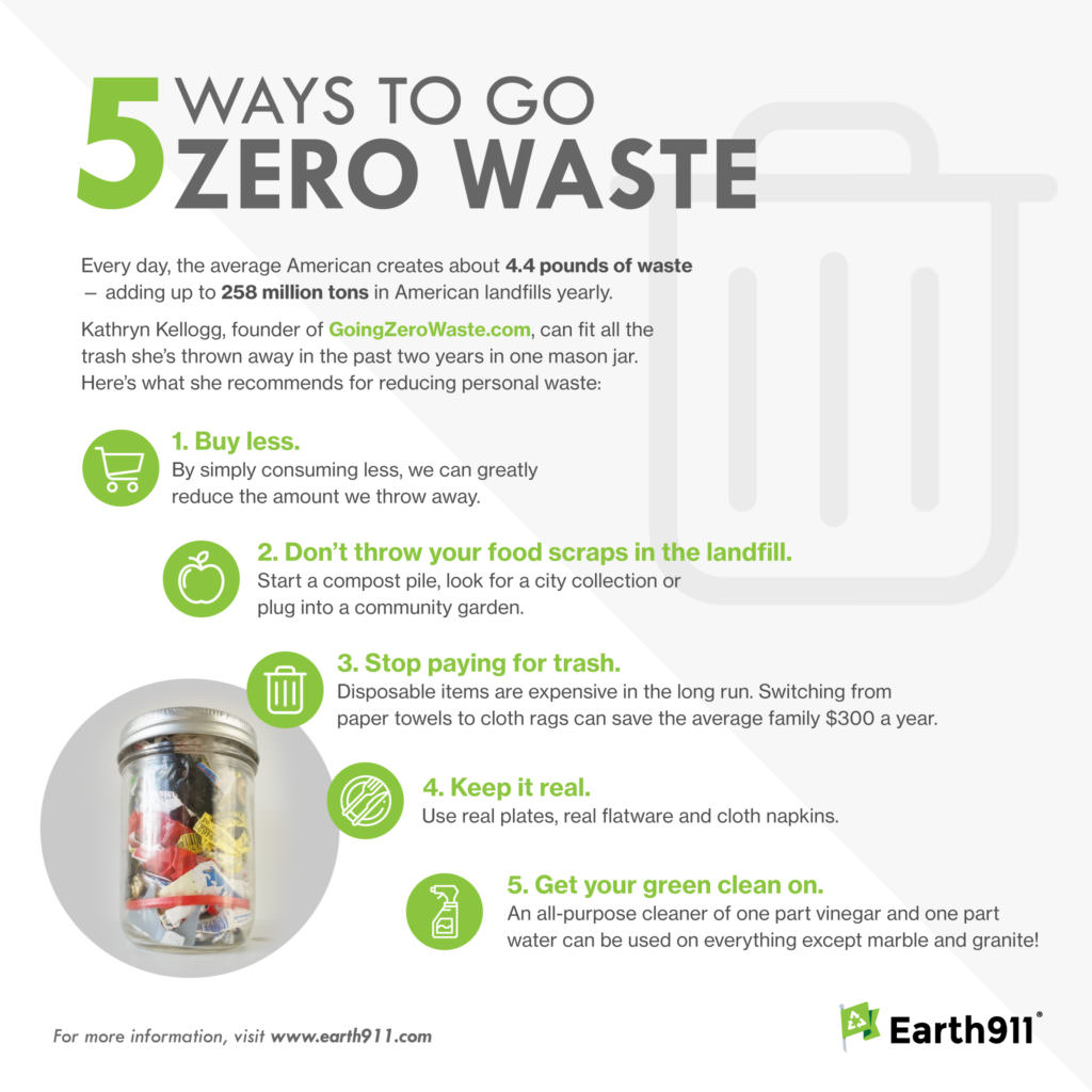
Why it works:
Tells a story: By presenting achievable steps, it empowers readers to take action towards a zero waste lifestyle, making the concept feel attainable.
Visual hierarchy: The infographic is organized into five clear sections, each highlighting a specific tip, making it easy to follow.
Color choices: It uses earthy tones that align with the sustainability theme, creating a cohesive and calming visual experience.
Typography: The fonts are clean and legible, ensuring that the information is accessible to a broad audience.
Text + visuals balance: Each tip is accompanied by an illustrative icon, reinforcing the message without overwhelming the viewer with text.
Final Thoughts
These infographics were all totally different in tone and style, but each one helped me understand something important about sustainability in a way that felt clear and impactful. Whether it was bold numbers, clean comparisons, or visual metaphors, they all show how powerful good design can be when you’re trying to get a message across.
It also made me think more about how I want to approach my own infographic project — not just what I want to say, but how I want it to feel. I’m excited to take what I learned from these examples and put it into something of my own.

Leave a comment